Getting Accurate and Consistent Colors in Prints
Why Your Colors Look Different in Print Than on Your Screen (And How to Fix It)
Have you ever spent hours perfecting the colors of your design on screen, only to have the printed version come back looking completely different? Maybe that rich blue turned purple. Or that perfect pastel looks washed out.
You're not alone—and you're not doing anything "wrong." The world of color reproduction between screens and print is full of hidden complexities.
Let's walk through why this happens and how you can take control of your color results for reliable, professional-grade printing every time.
💡 Did you know
The sRGB color space was literally designed to match the typical output of a 1990s CRT monitor under a D65 light source (roughly daylight at 6500K). That means even today, most digital images are stuck inside a "color box" based on 30-year-old monitor technology — all to keep colors consistent across millions of different devices!
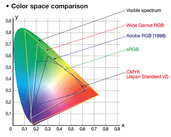
The Basics: Understanding Color Spaces (RGB, CMYK, and LAB)
Color spaces are the fundamental way colors are described digitally. But they’re not the same across different devices or outputs. Let’s break it down:
RGB: The Language of Screens
RGB stands for Red, Green, Blue—the three light-emitting colors used to build every color you see on screens: your phone, computer, TV, etc.
- RGB colors are additive. That means the more light you add, the closer you get to white.
- Large gamut: RGB can produce very vivid, bright colors—especially on modern HDR (High Dynamic Range) monitors that show even wider ranges.
- Problem for printing: Some colors that are easily shown on a backlit screen simply cannot be recreated with inks on paper.
CMYK: The Language of Printers
CMYK stands for Cyan, Magenta, Yellow, and Black (Key).
- CMYK colors are subtractive. Instead of emitting light, they absorb it, which is why combining inks eventually gets you black.
- Limited gamut: CMYK printing has fewer possible colors than RGB. That’s why vibrant colors on screen sometimes look duller in print.
- Expanded CMYK: Newer printers sometimes add extra colors (orange, green, violet, etc.) to widen the gamut and reproduce brighter shades.
LAB: A Universal Color Language
- LAB color is device-independent and models how humans actually perceive color.
It's used mostly behind the scenes or for advanced color correction work.

🛠️ Pro Tip: Calibrate, Then Create
Calibrate your monitor before you start designing, not after. Designing on an uncalibrated screen could bake in mistakes that are much harder to fix later.
A more detailed explaination of color spaces
Why Your Monitor Lies to You: The Importance of Monitor Calibration

Even if you’re working in the right color space, your screen could still be misleading you. Here’s why:
Monitors Are Inconsistent Out of the Box
- Different brands and models have their own color biases.
- Consumer monitors are often tuned for "vibrancy," not accuracy.
- Colors shift dramatically based on your viewing angle (especially with VA panels vs IPS panels).
Brightness and Lighting Conditions Matter
- A monitor set too bright will make your design look lighter than it prints. Monitors have brightness ratings called “nits”. They can range from 200-2000+. Most monitors are much too bright for print proofing. 150-250 max nits aka brightness is what a profiled monitor for print proofing will be within.
- Ambient lighting affects perceived color. Daylight, fluorescent lights, and incandescent bulbs all shift how your eyes see colors.
Monitor Types and Color Profiles
- sRGB: Standard for web use. Limited gamut, but safe and predictable.
- Adobe RGB: Wider gamut, better for professional photography and printing.
- D50 and D65 standards: Industry-standard lighting conditions for calibrating monitors for print or digital output.
Calibration Devices
Use hardware tools like:
- X-Rite i1Display
- Datacolor SpyderX
to create a true-to-life display environment.
Tip: Always soft-proof your designs inside Adobe Photoshop or Illustrator by assigning the correct printer/output profile to simulate how colors will look when printed.
🔍 Pro Tip: View Under Consistent Lighting
When checking proofs, always look at them under consistent, neutral lighting (like a D50 daylight bulb). Office fluorescent lights or direct sunlight will distort your color perception! These bulbs can be expensive. An alternative is getting bulbs with a K rating similar to the calibration selected (typically D50 or D65) We like 4000k-5000K light bulbs.
Why Prints Look Different from Printer to Printer

Even if you’ve done everything right on your end, different printers might still give you different results. Why?
- Even if you’ve done everything right on your end, different printers might still give you different results. Why?
- Different Printers = Different Capabilities: Some printers have wider color gamut’s than others. Printers start with CMYK inks (cyan, Magenta, Yellow and Black). However now days printers are sold with more ink options that can include 12+ ink colors. Printers may include additional ink colors like: Light Cyan, Light Magenta, Light Grey, Orange, Red, Green, Purple and even Blue. Some Print shops will select a printer for speed (sacrificing color gamut), others may go for a wider color range, and others for smoother gradients. This doesn’t even mention the different ink types and media.
- Inconsistent Printer Calibration: Not all printers are regularly calibrated or even calibrated. They may be operated with manufacture provided profiles. Colors can vary between the same model and ink configuration.
- Outdated Printer Profiles: Older or generic ICC profiles can lead to inaccurate color translation.
- Rendering Intents: Different printer settings handle “out-of-gamut” colors differently, sometimes preserving vibrancy, sometimes prioritizing accuracy.
-
Solution
- Always embed a correct color profile in your artwork.
- Communicate clearly with your printer about your color expectations.
- Consider using Pantone Spot Colors for mission-critical designs.
💡 Pro Tip: Simulate Print Colors On-Screen
In Photoshop or Illustrator, use View > Proof Setup and choose your printer’s color profile. This lets you soft proof your file — simulating how colors will actually print!
Color Profiles: Your Blueprint for Accurate Colors
Without a color profile, every device (monitor, printer, RIP software) guesses how to display your colors. No wonder things go wrong!
- Profiles tell devices what your colors are supposed to look like.
- Even if a printer can’t perfectly match every color, it can interpret your file much more accurately with a profile.
- Becareful when pasting artwork from different color spaces like photoshop or illustrator. The colors may display the same, but the print will look very different!
Converting RGB to CMYK: Most modern RIP software can smartly handle RGB artwork. But when a profile is attached, the RIP can adapt your RGB colors to the printer’s CMYK capabilities in a much more intelligent way, preserving as much color fidelity as possible.
🎯 Pro Tip: Always Embed Your Color Profile
When saving your final artwork (PDF, AI, PSD, or TIFF), make sure "Embed Color Profile" is checked. It’s a tiny step that makes a huge difference.
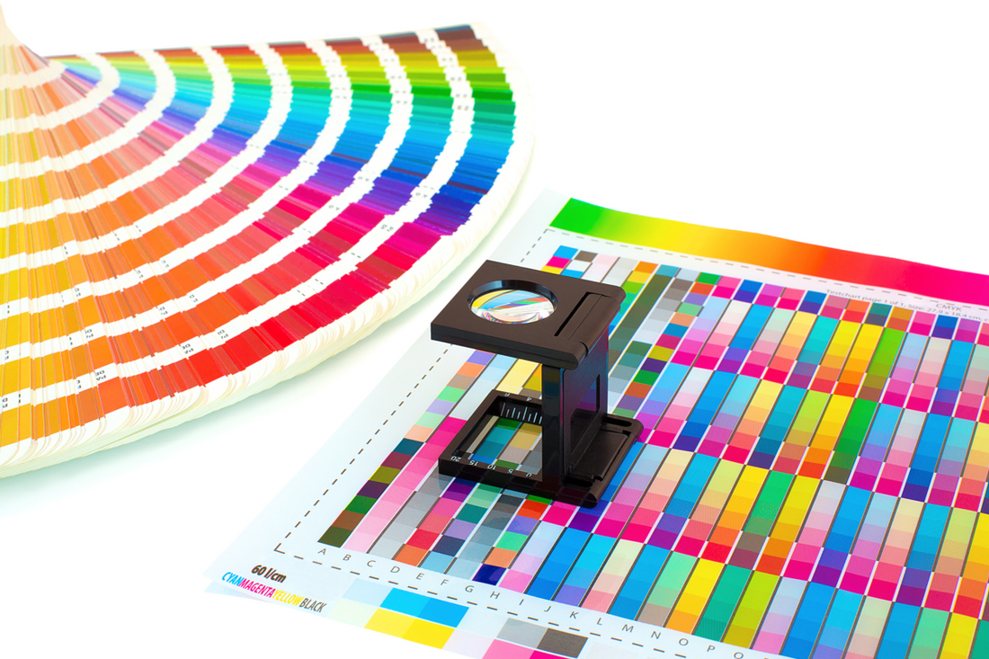
Spot Colors and Pantone Matching: The Gold Standard for Color Accuracy

When color has to be consistent (think: branding, corporate logos, product labels), you need to go beyond CMYK blending.
-
Why Pantone Spot Colors Matter
- Spot colors are pre-mixed inks, not combinations of CMYK dots.
- They provide extremely consistent results across different printing systems.
- Pantones are defined in books and managed in design software, so everyone involved is on the same page.
-
How to Work with Pantones
- Buy a Pantone Formula Guide to reference real printed swatches.
- View under proper lighting (like a D50 viewing booth) to avoid perceptual errors. If this isn’t in your budget try buying lightbulbs with a good CRI. Ensure all the lights have the same Kelvin rating like 5000k that matches closest to your chosen illuminant in your monitor profile (D50 or D65)
- Design in Pantone libraries inside Illustrator or Photoshop.
- Specify clearly to your printer that you're using spot colors.
Important: Pantone-matched prints aren't always 100% identical, but they’re usually much closer and more reliable than CMYK approximations.
Conclusion: Take Control of Your Color Destiny
Color consistency in printing isn't a mystery—it's a science.
By understanding color spaces, calibrating your monitor, embedding accurate profiles, and using tools like Pantone spot colors, you can turn unpredictable results into professional, reliable color reproduction.
No more "surprise" colors when you open that print package.
Just sharp, true, beautiful colors—every time.