5 Quick Fixes for Better Print Color
Your fast, colorful guide to nailing perfect prints to get better print color
💡 Did you know
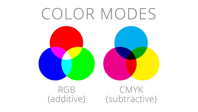
The vibrant colors you see in a professionally printed magazine might look dull on your computer screen because print uses CMYK color profiling, which mixes cyan, magenta, yellow, and black inks, while screens use RGB, blending red, green, and blue light. This difference can lead to a "color surprise" where up to 30% of printable colors can't be accurately displayed on a standard sRGB monitor, making color profiling a critical step for designers to avoid unexpected results!
🎯 1. Calibrate Your Monitor
Start with a good color on screen
- Use a hardware device like X-Rite i1Display or Datacolor SpyderX.
- Set your white point to D50 (Daylight 5000K) for print workflows.
- Recalibrate every 1–2 months for consistent accuracy.

We like using the i1 Profile Display, it's easy to use straight forward and doesn't require much knowledge out of the box.
2. Better Print Color = Embed Color Profiles in Every File
How does the printer know what color to print?
- Always embed your working color profile (like sRGB or AdobeRGB) when saving.
- Missing profiles = unpredictable colors at print.
- Essential for PDFs, TIFFs, PSDs, and AI files.
- a profile is better than no profile for better print color
sRGB
- Use: sRGB is a standardized color profile widely used in digital displays, web browsers, and consumer-grade devices, ensuring consistent color reproduction across platforms like monitors, printers, and cameras.
- Benefit: Its limited color gamut simplifies color management, making it ideal for web content and applications where precise, universally compatible color display is critical, reducing color mismatches.
- History: Developed in 1996 by Microsoft and HP, sRGB was created to provide a universal color standard for the internet and consumer electronics, becoming the default color space for most digital applications.
AdobeRGB:
- Use: AdobeRGB is a color profile used in professional photography, graphic design, and printing, offering a wider color gamut than sRGB for capturing and displaying more vibrant colors.
- Benefit: Its broader gamut allows for richer, more accurate color reproduction, especially for high-end print and digital editing, preserving subtle color details in professional workflows.
- History: Introduced by Adobe in 1998, AdobeRGB was designed to encompass most of the colors achievable in CMYK printing, becoming a standard for professionals needing enhanced color fidelity.

🌈 3. Soft Proof Your Designs
- In Photoshop/Illustrator: View > Proof Setup > Custom.
- Choose your printer's color profile for a realistic on-screen preview.
- Tweak your design before sending it to press.
📚 4. Use Pantone Spot Colors for Brand-Critical Work
- Invest in a Pantone Color Guide to see true ink colors. Better print colors means using spot colors
- Assign Pantone spot colors inside your design software.
- Communicate clearly with your printer about using Pantones.

💡 5. View Proofs Under Correct Lighting
- Review printed proofs under D50 (daylight-balanced) lighting.
- Fluorescent lights or sunlight can distort your color perception.
- Consistent lighting = confident color decisions and better print color
-
✨ Bonus Tip: Talk to Your Printer Early!
- Share your color profiles, Pantone callouts, and expectations upfront.
- A 5-minute chat can save you from costly reprints!